Wednesday, 26 November 2014

Gothika (2003) Film Analysis


Gothika (2003)

Directed by Mathieu Kassovitz

Horror/Thriller
Miranda Grey works at a women’s penitentiary, in the mental institution department. We first see her interviewing Chloe (one of the patients) about her rape that happened in her cell. Miranda doesn’t fully believe her story and thinks that her drug doses should be lowered. Miranda has to take a detour on her way home, as she goes over a bridge she swerves as she thinks she has seen a young girl standing in the road. When she goes to help the girl she suddenly bursts into flames. We hen see Miranda in a cell in the women’s penitentiary where she once worked. She finds out that she murdered her husband and becomes haunted by the same girl that she saw burst into flames. Miranda finds out she was a victim of rape and kept in a rape den that her husband created in an old barn. The ending of Gothika is open and leaves room for a sequel.

The opening scene to Gothika impressed me the most because it used dramatic, low key lighting; therefore this helped to create a tense atmosphere. The lighting on Chloe’s face is half-light, half dark; this gives the impression that she may look like a liar at the beginning, but she may not towards the end of the film. I also liked the cinematography that was used throughout the opening scene. Closes ups were used when Chloe was talking so that the audience focuses solely on her, as well as expressionist angles so that the viewer could understand Chloe and reflect on the tense, negative atmosphere. Long takes were also used when Chloe was talking; this is another technique used to engage the viewer with the character.


Another scene that impression me was the shower scene. The use of cinematography, editing and mise-en-scene allowed the scene to become tense and uneasy for the viewer to watch. The use of montage from slow to quick editing allows the suspense to build. Also, the use of close ups and fast paced editing allows the audience to feel a sense of panic. The low-key lighting and the parallel, non-diegetic music all contribute towards the sense of panic reflected into the audience; the music for this scene starts off with a violin combined with low bass notes, it then goes deadly silent before seeing  the girl, then synthesized keyboard notes are used to drag out and increase the suspense. The costumes, or should I say lack of, contribute towards the patients feeling exposed and violated, also it connotes their lack of freedom and trust.

Gothika has helped me to understand the horror genre through its use of; character representations, mise-en-scene, sound, editing, cinematography, narrative and ideologies.
V.Propp and T.Todorov defined the classical Hollywood narrative’s structure. They broke it down into five phrases; ‘diegsis set out equilibrium’; ‘equilibrium disrupted’; ‘quest to establish new stability’; ‘quest achieved’; ‘happy ending’; ‘new equilibrium’. Gothika follows this theory for the majority of the film; the ending is not happy, but there is a new equilibrium. The ending is an open ending; it shows Miranda walking down the street, after meeting with Chloe, and a boy appears in the middle of the road as a fire truck speeds past. 


There are also stereotypes within Gothika. The psycho killer, Sheriff Ryan, is represented by a middle aged man who has an absent father and grew an over-dependent relationship with his mother. The male hero, Pete Graham, is very masculine, has facial hair, and is good looking. The female survivor/final girl, Miranda Grey, has dark hair, doesn’t wear much make-up and is a tom boy. The only character that does not follow the typical character stereotypes is the female victim, Chloe, who has black hair and is not killed. Stereotypes are used in the film Gothika to enable the audience to fully understand each character, as well as giving the audience hints as to what will happen with certain characters throughout the rest of the film. 


Thomas Schatz’s “Genre Theory” can be applied to Gothika. Gothika has a hybrid genre; it is called as a horror and a thriller, therefore the audience can expect; gore, phallic weapons and a stereotypical antagonist from the genre horror; from the thriller genre the audience can expect tense atmosphere’s, sudden plot twists and unexpected attacks.

The use of close ups, high angles, low angles, shaky camera movements and montages contributes largely towards the moods and atmospheres felt throughout the film.

The aspects of the film that I want to include un my own trailer are expressionist angles and shot distances, such as close ups, long shots and high and low angles. I would also like to include montage, because this increases tension. Also low-key lighting contributes towards the atmosphere of the film therefore that would be an important element within the making of my horror trailer. I would avoid using scenes would pro-long or confuse the audience; for example, the dream sequences within Gothika can be considered as quite confusing. 

The best aspect of the film was exploring the inside of the mental institution during the scene where the guards were chasing Miranda. I could re-create this by using shaky camera angles to influence a sense of panic, also by using montages – slow to quick paced editing. I would also use point of view shots, close ups, and long shots to show action from different perspectives.

Thursday, 20 November 2014

Patrick (2013) Film Analysis

Patrick (2013)
Directed by Mark Hartley
Horror, Sci-Fi, Thriller
Patrick (2003) is an Australian horror film based on the original film, Patrick, made in 1978. Kathy Jacquard seeks a job to take her mind off of her recent break-up; she gets interviewed and accepted then and there by Doctor Roget, at an isolated psychiatric clinic. Nurse Williams shows Kathy around the clinic, explaining who and why the patients have been admitted. Kathy meets Patrick, who has supposedly been involved in a car crash with his family and is the only survivor. Patrick received brain injuries; therefore he cannot talk or communicate with the staff. Doctor Roget uses shock treatment to shock his brain into creating a reaction; Kathy disagrees with this method of treatment and therefore falls out with Doctor Roget. Patrick starts to communicate with Kathy through spitting, then he shows his powers of telekinesis by communicating with her through a computer monitor. Kathy soon discovers that Patrick is an obsessive psychopath as he begins to hurt everyone around her.

A scene that impressed me was were Patrick was talking to Kathy via a computer monitor. The scene started off slow, and gradually sped up as Patrick revelled more about himself to Kathy. Towards the end of the scene when the tension was at its highest, the camera would jump between the computer monitor, and Patrick’s face. I enjoyed this scene because it used collision cutting to create tension, and also low key lighting was used to compliment the dark atmosphere. Expressionist angles were also used during this scene, the camera would cut to Kathy’s face every so often so that the audience could analyse her reaction; also, when the camera was cutting between Patrick’s face and the computer screen, the shot distances were increasing, the last shot was an extreme close up of Patrick’s face. I could re-create this scene in my own trailer by using close-up shots, and extreme close-up shots, as well as slow to quick paced editing, creating a montage effect. 


Another scene that impressed me was where Nurse Williams was showing Kathy around, it allows the audience to get a sense of the environment inside the house; within this scene close ups, long shots, medium shots and zooms were used, low-key lighting was also used to add to the creep, historic elements of the house – no sound track was used during this scene so that the audience concentrated on the dialogue. 

Watching this horror film allowed me to understand how important elements such as sound, editing and ideologies are when creating a psychological horror film. Parallel music is used throughout the film, in the form of stringed instruments which help to amplify tension and panic. The use of collision cutting and slow to quick montage also helped to build suspense and pressure in the right areas; such as when Patrick is talking to Kathy. Ideologies such as sexism towards women, sadism and feelings/beliefs outside the CDI (cultural dominant ideologies) help to shape the protagonist and explain to the audience why he is the way that he is; for example, Patrick’s mother regarded him as an annoyance when she was with other men, therefore Patrick grew a hate towards men that had relations with his mother; over time Patrick also grew a disliking towards his mother for having relations with other men. 

I would like to include parallel music, point of view shots, and creepy, enclosed locations in my own trailer because I think that these elements help to project uneasiness and dread into the audience. I would also like to avoid contrapuntal music, because I think that it is very hard to make a horror film appear scary or even funny with contrapuntal music as it goes against the overall mood of the scene. I would also avoid using CGI in my trailer because it can look fake and unrealistic, like some of the CGI used in Patrick when Brian lost control of his car. 

Patrick’s character is that of a psycho killer/serial killer. The audience are allowed to find out more about him as the film goes on; towards the end of the film we see flashbacks of his teenage years. In the flashbacks we see him killing his mother and her lover, Patrick suggests to the audience that he is obsessive and is in love with his mother. His love for his mother turns into anger and hate when with other woman, so he feels the need to watch them suffer, therefore he is a sadist. Patrick goes against horror conventions, most killers do not appear clean, and well groomed like Patrick does. There are character stereotypes within this film, for example the girl at the beginning of the film gets killed, she was young and blonde. Kathy is the final girl, and survivors all the way through the film, she is a brunette, dresses slightly like a tomboy and is very intelligent; Kathy also uses a big needle, which is a representation of a phallic weapon, to kill Patrick. 

I think that the establishing shot at the beginning of the film of the psychiatric clinic was very powerful, this is because half of the building is old, and half of it has been modernised; also the old half of the building looks dull, and creepy, whereas the more modern half of the building is painted white. This suggests that there is both good and evil within the house, the old half of the building also compliments the psychiatric clinic in the original Patrick (1978), which can be seen in the trailer below.


The film reflects its historical context through the use of technology. The film was made in 2013, therefore recent, and up-to-date technology was used throughout the scenes. A scene that demonstrates this is where Kathy’s phone starts to ring when she is upstairs, the phone sounds like an old dated phone because of the ringtone, but when Kathy picks up the phone we see that it is an iPhone. The iPhone has been purposely placed where a house phone would usually sit because it demonstrates the advance in technology when comparing the remake and the original. The film also pays tribute to the original 1978 version by using out-dated technology within the clinic, this also adds a sense of doom and dread, and also a negative atmosphere throughout the scenes situated inside the clinic.

Total Film Magazine Cover Analysis


Total Film

Total Film is a magazine that focuses on films and is based in the UK; it is also published every four months. When looking at the magazine, some elements contribute towards it being aimed towards cinema-goers that are open to most genres of films, such as fantasy, adventure and comedy. The title is big and bold, and can easily be read due to the bold lettering. Although the title is big and bold it does not take the attention away from the main image. The use of inputting a word inside of a letter it allows you to have more space on the cover.

The front cover looks busy, but does not seen overly confusing. The bright colours help to divert your eyes to different areas of the cover, the titles and subtitles are also easy to read against the colourful background. The greens and yellows used also connote a ‘trippy’ atmosphere towards the oddness of Wonka’s personality in the film Charlie And The Chocolate Factory. The redness of Wonka’s jacket also connotes that as well as a happy, playful side, he also has a dangerous personality. The selling line suggests that this is a fun magazine aimed at eager film goers and critics.

The use of writing and space gives the magazine cover a clear target audience; you can also see that it focuses on the adventure, sci-fi and fantasy genres due to the colours and use of the main image.
Due to the bright colours this could suggest that the film that is being advertised is aimed at a younger audience. It also has the real name of the person playing the character in the image.
There is also the use of stars on this cover, this could suggest that this is how they mark films, the more stars they have, the better the film was; this is suggests that this magazine is aimed towards both amateur and professional film critics.

The image is very clear and gives suggestions as to the personality of the character. The bright colours suggest that he lives in a happy, fantasy world. His face is within the centre of the front cover, making him the main focal point.

Fangoria Magazine Cover Analysis


Fangoria

Fangoria is a film magazine that focuses on the horror genre. It originated in the US, but is also distributed internationally. When looking at the magazine and comparing it with others it looks like it would appeal to males around the age of 16-19. This film magazine looks quite immature; the images do not contain any seriousness within them. The title is in bold, red letters; red is usually associated with blood, therefore it is the perfect colour for this magazine as it focuses on films within the horror genre.

The image displays a half eaten woman; the image doesn’t suggest whether she is the victim or the protagonist. The images seem to be the main selling point upon this magazine cover, this also demonstrates that this magazine is aimed at males that would prefer to look at images rather than read big lumps of text.

One of the selling lines says that the magazine features monsters, aliens and other bizarre creatures, this selling line does not use full sentences, and instead it uses individual words as this is what would appeal to their target audience.

The font used for the title of the magazine and the other titles and selling lines is not basic, it involves capital letters and also some of the letters in the title are displayed differently, this suggests that this is not your normal film magazine.

The magazine cover also is not over crowded with words or images, the space is used well and the images are not obstructed by writing. Also, the majority of the images look like they have been taken in isolated locations; this is a trait within the horror genre.

The colours focus around yellow, red and black; these colours work well to set the scene for a magazine that focuses on the horror genre.

The title of the magazine is just the words ‘fan’ and ‘gore’ together, the title, as well as the images, also tell the viewer that the magazine contains images are for fans of gory horrors overloaded with latex effects.

The magazine was published in the 80’s, therefore it would feature films such as Dawn of the Dead, Day of the Dead and Basket Case; these are films that were popular in the 80s, but now we would look at them and think that they are unrealistic and cheesy.

One of the selling lines sells Dick Smith, an Oscar-winning Special FX master; the magazines also feature Rick Baker, another special FX master that worked on the special FX in American Werewolf. Using well-known masters in these trades will entice gory horror fans to purchase the magazine.  

Empire Magazine Cover Analysis


Empire

Empire is a magazine that is published monthly in Britain. By looking at the front cover you can see that the use of colours and images suggest that this issue of the magazine is specialising in the fantasy and adventure genres. The title is boldly in gold, the colour gold suggests wealth and money, and this could suggest that this magazine is a high end film magazine. The colour gold could also contribute towards the narrative of the film advertised.

There is not as many subtitles on this magazine cover as there are on previous ones, they are relying on their choice of image and colours to encourage people to buy their magazine.
The selling line at the bottom of the magazine makes you intrigued to know what is inside. The name of the film advertised in also in bold letters, this helps to advertise the film.

The image is used to give the viewer an insight into the film if they have not seen it before. The image displays what looks like the protagonist and the antagonist; this gives the front cover a sense of mystery as we cannot tell how the film will end by looking at this image.

The dull, dark colours suggest that this film has mysterious elements to it; it also suggests that it has a dark side to the film. The image also gives the viewer a sense of location, as the image shows a dark, scary looking forest. There is also the use of a sticker on the side of the magazine; this allows the comment to stand out from the main image as it is the opposite colour to the background image.

The use of gold circle behind The Dark Knight Rises review suggests that it has a ‘gold standard’, this therefore sends the message that they have to purchase Empire in order to get the proper verdict. 

Entertainment Magazine Cover Analysis


Entertainment

Entertainment weekly is a film magazine that is published weekly in America. By looking at the image it looks as though it is aimed at a more mature audience, this magazine looks like it would attract males between the ages of 25-30. The title is bold and easy to read, the colour of the title also ties in with the rest of the colours used throughout the magazine cover. The font used for each title and sub title is easy to read and is very basic.

The composition of the image can be seen as quite demeaning, this is due to the low angle, expressionist angle that has been used. Although the angle of the image is titling downwards, his facial expression doesn’t lack any confidence; this image therefore challenges conventions due to the angle it is taken at, if the angle is tilting downwards it usually makes the person within the shot look small and weak. The name of the person within the image is also clearly written in a bigger font size than the rest of the titles and selling lines.

The mise-en-scene also helps to conjure the Victorian diegsis of the film.
Only four sub titles are used, this means makes the magazine cover not look crowded or contain too much empty space. The magazine cover also features other well-known actors on the front cover as advertisement to encourage people to buy the magazine.

The colours used within this magazine cover suggests that the character within the image is not very welcoming, it suggests what kind of character he portrays and gives the audience a clue as to whether he is the protagonist or the antagonist. The colours give the atmosphere of the magazine cover an unhappy, sad, cold and mysterious feel.

The use of space is also used well, the writing does not cover the importance aspects of the main image, and it also doesn’t leave too much free space. The hints of red throughout the magazine cover suggest that the character is from a film that is from the horror or thriller genre.

Scream Poster Analysis


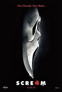
Scream 4

Scream 4 was released in 2011 and is the fourth scream film to be released; the first was released in 1996. All of the Scream films have been produced by Americans. The scream films have always been within the horror/mystery genre. By looking at the poster it looks like it would attract males and females between the ages of 15-30. It has a 15 certificate and features a predominately female cast, it also features two final girls; therefore it would appeal to both sexes, rather than more of a male audience.

The mask is the iconic part of every scream film, they have used the iconic mask for their fourth scream poster, but they have shaped the end of it into a knife. This could suggest that the fourth film will be even more gorgy. The knife could also be a representation of a phallic symbol, and also the dark background is used as a pathetic fallacy for night. The black background also brings a sense of mystery to the main image, it doesn’t give any information as to who the victim/s are, it gives a clue as to how they may be killed. The black background also helps to bring your attention to the selling line, title, date of release, and the main image.

The tag line suggests that their audience would have watched the three previous films and would therefore know what to expect within a typical scream film; ‘New Decade, New Rules’ suggests that it will not follow in the footsteps of the other three scream films. The colours, image and selling line suggests that the film is within the horror/mystery genre. The use of the colour red suggests that there will be lots of blood, which is a typical aspect within the horror genre, and the colour white could link to the overall film being packed with mysterious scenarios, reflecting the other genre that the film is linked to. 

Alien Poster Analysis


Alien

Alien is within the horror/sci-fi genre and was released in 1979, and is an American and English Produced film. By looking at this poster it looks like the target audience would be males between the ages of 25-30 years old.

The title is very spaced out, this could be a representation of the infinite amount of space there is in outer space. The font is also very easy to read and is very basic; the font doesn’t take the attention away from the main image, but it contrasts with the black background therefore it still stands out, just not as dominantly as the main, central image.

The tag line contributes towards what other genre this horror film is linked with, it also suggests the location in which the film is based in. The colours also link to this; green is predominantly with alien like creates; therefore incorporating this colour into the poster gives the audience information as to what other genre it links into.

The image could represent a planet or an egg; the crack could also represent the birth of extra-terrestrial life, or the destruction of a planet. The black background could represent outer space; it allows the title, tag line and image to be the most dominant aspects of the film poster. The use of a black background also connotes sense of mystery into the poster. The colour green and the use of an egg as the main image are iconic to the science fiction genre.

Sinister Poster Analysis


Sinister

The film sinister was released in 2012 and is an American and English produced film. By looking at the film poster it looks like it would attract the a female and male audience between the ages of 12-35. This horror film contains aspects of other genres such as mystery and thriller; these are reflected through the main image and overall feel of the image.

The main image on the film poster could represent that the killer does not kill anyone him/herself, but uses a second hand source; in this case he/she possesses a young blonde person. The image drawn in blood looks inhumane; this could suggest the killer is not physically human. The tape at the bottom of the poster could be an important factor within the film; it could contain something that relates to the main plot of the narrative.

The comment at the top of the film poster names two iconic horror films, this could suggest that it will not be another failed horror film, by publishing that the director also directed two other films that have been successful suggests that this film will follow in their footsteps. The selling line also reflects how the monster operates, it also suggests that the audience will be terrified; for example, it could suggest that you will not sleep properly after seeing the film.

The colours suggest that this film will contain a lot of blood, which evidently results in lots of killings. The use of the off white colour brings a more mystery side to the image, also the secondary killer is drawn onto the wall, and therefore it makes him seem mysterious. The selling line suggests that this film will be a thriller.

The main characters clothing suggest that she is an innocent victim in the film; the colour white usually connotes innocence. Her blonde hair would also suggest that she is very girly, and isn’t very intelligent; this is the norm for horror conventions and character stereotypes.

The cracks within the background of the poster and the floorboards at the bottom of the poster suggests that it is going to be set in a house, it also suggests that it is going to be set in an isolated location, which is an iconic aspect within horror films.

Trick 'r Treat Poster Analysis


The film Trick ‘r Treat was released in 2007 and was produced by Americans. This horror film is also a comedy and a thriller.

The image suggests that children may be involved within this film, or that a child’s toy has been possessed. The mask over the child’s head suggests that it is not human, but when looking at the hands it suggests that it once was. The image shows that the protagonist is in an enclosed, isolated location, this could suggest that the film is a thriller.

The overall colour of the poster is red, it ranges from dark to light, this could also suggest that the film will be a thriller. The colour red is iconic within horror films, but the image and slogan suggest that the horror film has other genres included such as aspects of the thriller genre. When looking at the image I cannot see anything that would relate towards the film containing comical aspects, this could be because they wanted the film to be a serious film, rather than a film like Scary Movie.
The title looks like it has been burnt into the paper; this could suggest that fire is the main element within the film.

The selling line rhymes, this could be a reflection of a nursery rhyme and therefore link children into the plot. It could also suggest that the main protagonist is a child and is the one of the main characters within the story line.

Although it looks like we are looking down on the protagonist in the image, he/she is holding a very strong posture, therefore reflecting confidence which is a trait of a good killer.

The font used for the title is quite thin, but the colours help to make the title one of the main focal points on the poster. The font could be thin to suggest someone dragging their nail down a wall, or someone burning it into a wall using a thin utensil. The font used for the selling line is quite authentic and bold, this could reinforce the confidence within the main protagonist. 

Dawn of the Dead (1979) Image Analysis


In this scene from Dawn of the Dead (DOTD) (1979) the audience see that Stephan (Flyboy) challenges his original stereotype of the male hero. Stephan is represented as a good looking television reported that can fly a plane. The audience find out in this scene that he cannot use a gun correctly, and nearly shoots Peter. Stephan’s gun is a representation of his masculinity, which is pretty much non-existent in this scene. A medium shot is used in this scene so that the audience concentrate on Stephan’s facial expressions, and Rogers’s ability to shoot perfectly; this could also be considered as an expressionist angle because it shows how Stephan is confused and shocked, whereas Roger is calm and relies on his own ability in order to save Peter from getting attacked. Thomas Schatz’s “Genre Theory” is relevant in this scene, as well as many others, DOTD (1979) is represented as a horror/action, the guns are a signification of an action film, as well as the slow to quick montages that are used in this scene, as well as lots of others.

Dawn of the Dead (2004) Image Analysis


This image from Dawn of the Dead (DOTD) (2004) brings forward continuing rise of feminism that was touched upon in the original DOTD (1979). The characters do not comply with their stereotypes; for example, Ana has blonde hair, and turns out to be the final girl, the final girl stereotype is that they have black or brown hair and are more masculine than feminine. Although Ana is blonde, she has a tomboy attitude and is aiming a phallic weapon towards Steve. Steve has been uncooperative throughout the film, therefore he deserved his death. Steve wears mostly black clothing throughout DOTD (2004), this is to connote that he has an evil, uncaring attitude towards everyone apart from himself. DOTD (2004) also complies with Thomas Schatz “Genre Theory”, DOTD (2004) is classed as a sci-fi, action and a horror; sci-fi is represented through the use of zombies; action is represented through the use of guns and slow to quick montages, an example of this is where the zombies are climbing up the stairs and the camera focuses on the shot gun shells that are falling out of CJ’s gun as he is shooting the zombies; horror is demonstrated through the use of body horror. The low-key lighting within this scene allows the audience to gain a sense of seriousness, as well as tension because of the situation that Ana has been placed in. The positioning of the camera, as well as the focus, allows the audience to focus on Steve and the gun, rather than Ana.

Psycho (1960) Image Analysis


This is the last shot of Marion that we see after her death in the film Psycho (1960). The atmosphere within this scene holds a sadistic vibe, but the high-key lighting brings a sense of innocence into the scene. The eye could be a representation of the world, and the pupil could represent how there is evil within it, and how she has witnessed evil (her death). The teardrop could represent purity and how it was taken away from Marion when she had sex with her boyfriend near the beginning of the film, as well as when she stole the money. The expressionist angle also allows the audience to understand the mood of the scene. The teardrops, could represent how her life has been washed away, earlier on in this scene we also see her blood being washed down the plug hole, this also corresponds with the idea of her life being washed away. Within this scene 57 shots were used to build a sense of panic, the fast paced montage allowed the scene to become more realistic and tense for the audience.