Showing posts with label 1c: Research (Magazines and Posters). Show all posts

Thursday, 20 November 2014

Total Film Magazine Cover Analysis


Total Film

Total Film is a magazine that focuses on films and is based in the UK; it is also published every four months. When looking at the magazine, some elements contribute towards it being aimed towards cinema-goers that are open to most genres of films, such as fantasy, adventure and comedy. The title is big and bold, and can easily be read due to the bold lettering. Although the title is big and bold it does not take the attention away from the main image. The use of inputting a word inside of a letter it allows you to have more space on the cover.

The front cover looks busy, but does not seen overly confusing. The bright colours help to divert your eyes to different areas of the cover, the titles and subtitles are also easy to read against the colourful background. The greens and yellows used also connote a ‘trippy’ atmosphere towards the oddness of Wonka’s personality in the film Charlie And The Chocolate Factory. The redness of Wonka’s jacket also connotes that as well as a happy, playful side, he also has a dangerous personality. The selling line suggests that this is a fun magazine aimed at eager film goers and critics.

The use of writing and space gives the magazine cover a clear target audience; you can also see that it focuses on the adventure, sci-fi and fantasy genres due to the colours and use of the main image.
Due to the bright colours this could suggest that the film that is being advertised is aimed at a younger audience. It also has the real name of the person playing the character in the image.
There is also the use of stars on this cover, this could suggest that this is how they mark films, the more stars they have, the better the film was; this is suggests that this magazine is aimed towards both amateur and professional film critics.

The image is very clear and gives suggestions as to the personality of the character. The bright colours suggest that he lives in a happy, fantasy world. His face is within the centre of the front cover, making him the main focal point.

Fangoria Magazine Cover Analysis


Fangoria

Fangoria is a film magazine that focuses on the horror genre. It originated in the US, but is also distributed internationally. When looking at the magazine and comparing it with others it looks like it would appeal to males around the age of 16-19. This film magazine looks quite immature; the images do not contain any seriousness within them. The title is in bold, red letters; red is usually associated with blood, therefore it is the perfect colour for this magazine as it focuses on films within the horror genre.

The image displays a half eaten woman; the image doesn’t suggest whether she is the victim or the protagonist. The images seem to be the main selling point upon this magazine cover, this also demonstrates that this magazine is aimed at males that would prefer to look at images rather than read big lumps of text.

One of the selling lines says that the magazine features monsters, aliens and other bizarre creatures, this selling line does not use full sentences, and instead it uses individual words as this is what would appeal to their target audience.

The font used for the title of the magazine and the other titles and selling lines is not basic, it involves capital letters and also some of the letters in the title are displayed differently, this suggests that this is not your normal film magazine.

The magazine cover also is not over crowded with words or images, the space is used well and the images are not obstructed by writing. Also, the majority of the images look like they have been taken in isolated locations; this is a trait within the horror genre.

The colours focus around yellow, red and black; these colours work well to set the scene for a magazine that focuses on the horror genre.

The title of the magazine is just the words ‘fan’ and ‘gore’ together, the title, as well as the images, also tell the viewer that the magazine contains images are for fans of gory horrors overloaded with latex effects.

The magazine was published in the 80’s, therefore it would feature films such as Dawn of the Dead, Day of the Dead and Basket Case; these are films that were popular in the 80s, but now we would look at them and think that they are unrealistic and cheesy.

One of the selling lines sells Dick Smith, an Oscar-winning Special FX master; the magazines also feature Rick Baker, another special FX master that worked on the special FX in American Werewolf. Using well-known masters in these trades will entice gory horror fans to purchase the magazine.  

Empire Magazine Cover Analysis


Empire

Empire is a magazine that is published monthly in Britain. By looking at the front cover you can see that the use of colours and images suggest that this issue of the magazine is specialising in the fantasy and adventure genres. The title is boldly in gold, the colour gold suggests wealth and money, and this could suggest that this magazine is a high end film magazine. The colour gold could also contribute towards the narrative of the film advertised.

There is not as many subtitles on this magazine cover as there are on previous ones, they are relying on their choice of image and colours to encourage people to buy their magazine.
The selling line at the bottom of the magazine makes you intrigued to know what is inside. The name of the film advertised in also in bold letters, this helps to advertise the film.

The image is used to give the viewer an insight into the film if they have not seen it before. The image displays what looks like the protagonist and the antagonist; this gives the front cover a sense of mystery as we cannot tell how the film will end by looking at this image.

The dull, dark colours suggest that this film has mysterious elements to it; it also suggests that it has a dark side to the film. The image also gives the viewer a sense of location, as the image shows a dark, scary looking forest. There is also the use of a sticker on the side of the magazine; this allows the comment to stand out from the main image as it is the opposite colour to the background image.

The use of gold circle behind The Dark Knight Rises review suggests that it has a ‘gold standard’, this therefore sends the message that they have to purchase Empire in order to get the proper verdict. 

Entertainment Magazine Cover Analysis


Entertainment

Entertainment weekly is a film magazine that is published weekly in America. By looking at the image it looks as though it is aimed at a more mature audience, this magazine looks like it would attract males between the ages of 25-30. The title is bold and easy to read, the colour of the title also ties in with the rest of the colours used throughout the magazine cover. The font used for each title and sub title is easy to read and is very basic.

The composition of the image can be seen as quite demeaning, this is due to the low angle, expressionist angle that has been used. Although the angle of the image is titling downwards, his facial expression doesn’t lack any confidence; this image therefore challenges conventions due to the angle it is taken at, if the angle is tilting downwards it usually makes the person within the shot look small and weak. The name of the person within the image is also clearly written in a bigger font size than the rest of the titles and selling lines.

The mise-en-scene also helps to conjure the Victorian diegsis of the film.
Only four sub titles are used, this means makes the magazine cover not look crowded or contain too much empty space. The magazine cover also features other well-known actors on the front cover as advertisement to encourage people to buy the magazine.

The colours used within this magazine cover suggests that the character within the image is not very welcoming, it suggests what kind of character he portrays and gives the audience a clue as to whether he is the protagonist or the antagonist. The colours give the atmosphere of the magazine cover an unhappy, sad, cold and mysterious feel.

The use of space is also used well, the writing does not cover the importance aspects of the main image, and it also doesn’t leave too much free space. The hints of red throughout the magazine cover suggest that the character is from a film that is from the horror or thriller genre.

Scream Poster Analysis


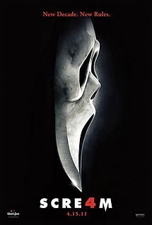
Scream 4

Scream 4 was released in 2011 and is the fourth scream film to be released; the first was released in 1996. All of the Scream films have been produced by Americans. The scream films have always been within the horror/mystery genre. By looking at the poster it looks like it would attract males and females between the ages of 15-30. It has a 15 certificate and features a predominately female cast, it also features two final girls; therefore it would appeal to both sexes, rather than more of a male audience.

The mask is the iconic part of every scream film, they have used the iconic mask for their fourth scream poster, but they have shaped the end of it into a knife. This could suggest that the fourth film will be even more gorgy. The knife could also be a representation of a phallic symbol, and also the dark background is used as a pathetic fallacy for night. The black background also brings a sense of mystery to the main image, it doesn’t give any information as to who the victim/s are, it gives a clue as to how they may be killed. The black background also helps to bring your attention to the selling line, title, date of release, and the main image.

The tag line suggests that their audience would have watched the three previous films and would therefore know what to expect within a typical scream film; ‘New Decade, New Rules’ suggests that it will not follow in the footsteps of the other three scream films. The colours, image and selling line suggests that the film is within the horror/mystery genre. The use of the colour red suggests that there will be lots of blood, which is a typical aspect within the horror genre, and the colour white could link to the overall film being packed with mysterious scenarios, reflecting the other genre that the film is linked to. 

Alien Poster Analysis


Alien

Alien is within the horror/sci-fi genre and was released in 1979, and is an American and English Produced film. By looking at this poster it looks like the target audience would be males between the ages of 25-30 years old.

The title is very spaced out, this could be a representation of the infinite amount of space there is in outer space. The font is also very easy to read and is very basic; the font doesn’t take the attention away from the main image, but it contrasts with the black background therefore it still stands out, just not as dominantly as the main, central image.

The tag line contributes towards what other genre this horror film is linked with, it also suggests the location in which the film is based in. The colours also link to this; green is predominantly with alien like creates; therefore incorporating this colour into the poster gives the audience information as to what other genre it links into.

The image could represent a planet or an egg; the crack could also represent the birth of extra-terrestrial life, or the destruction of a planet. The black background could represent outer space; it allows the title, tag line and image to be the most dominant aspects of the film poster. The use of a black background also connotes sense of mystery into the poster. The colour green and the use of an egg as the main image are iconic to the science fiction genre.

Sinister Poster Analysis


Sinister

The film sinister was released in 2012 and is an American and English produced film. By looking at the film poster it looks like it would attract the a female and male audience between the ages of 12-35. This horror film contains aspects of other genres such as mystery and thriller; these are reflected through the main image and overall feel of the image.

The main image on the film poster could represent that the killer does not kill anyone him/herself, but uses a second hand source; in this case he/she possesses a young blonde person. The image drawn in blood looks inhumane; this could suggest the killer is not physically human. The tape at the bottom of the poster could be an important factor within the film; it could contain something that relates to the main plot of the narrative.

The comment at the top of the film poster names two iconic horror films, this could suggest that it will not be another failed horror film, by publishing that the director also directed two other films that have been successful suggests that this film will follow in their footsteps. The selling line also reflects how the monster operates, it also suggests that the audience will be terrified; for example, it could suggest that you will not sleep properly after seeing the film.

The colours suggest that this film will contain a lot of blood, which evidently results in lots of killings. The use of the off white colour brings a more mystery side to the image, also the secondary killer is drawn onto the wall, and therefore it makes him seem mysterious. The selling line suggests that this film will be a thriller.

The main characters clothing suggest that she is an innocent victim in the film; the colour white usually connotes innocence. Her blonde hair would also suggest that she is very girly, and isn’t very intelligent; this is the norm for horror conventions and character stereotypes.

The cracks within the background of the poster and the floorboards at the bottom of the poster suggests that it is going to be set in a house, it also suggests that it is going to be set in an isolated location, which is an iconic aspect within horror films.

Trick 'r Treat Poster Analysis


The film Trick ‘r Treat was released in 2007 and was produced by Americans. This horror film is also a comedy and a thriller.

The image suggests that children may be involved within this film, or that a child’s toy has been possessed. The mask over the child’s head suggests that it is not human, but when looking at the hands it suggests that it once was. The image shows that the protagonist is in an enclosed, isolated location, this could suggest that the film is a thriller.

The overall colour of the poster is red, it ranges from dark to light, this could also suggest that the film will be a thriller. The colour red is iconic within horror films, but the image and slogan suggest that the horror film has other genres included such as aspects of the thriller genre. When looking at the image I cannot see anything that would relate towards the film containing comical aspects, this could be because they wanted the film to be a serious film, rather than a film like Scary Movie.
The title looks like it has been burnt into the paper; this could suggest that fire is the main element within the film.

The selling line rhymes, this could be a reflection of a nursery rhyme and therefore link children into the plot. It could also suggest that the main protagonist is a child and is the one of the main characters within the story line.

Although it looks like we are looking down on the protagonist in the image, he/she is holding a very strong posture, therefore reflecting confidence which is a trait of a good killer.

The font used for the title is quite thin, but the colours help to make the title one of the main focal points on the poster. The font could be thin to suggest someone dragging their nail down a wall, or someone burning it into a wall using a thin utensil. The font used for the selling line is quite authentic and bold, this could reinforce the confidence within the main protagonist.