Scream 4
Scream 4 was released in 2011 and is the fourth scream film to be released; the first was released in 1996. All of the Scream films have been produced by Americans. The scream films have always been within the horror/mystery genre. By looking at the poster it looks like it would attract males and females between the ages of 15-30. It has a 15 certificate and features a predominately female cast, it also features two final girls; therefore it would appeal to both sexes, rather than more of a male audience.
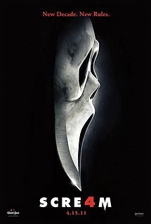
The mask is the iconic part of every scream film, they have used the iconic mask for their fourth scream poster, but they have shaped the end of it into a knife. This could suggest that the fourth film will be even more gorgy. The knife could also be a representation of a phallic symbol, and also the dark background is used as a pathetic fallacy for night. The black background also brings a sense of mystery to the main image, it doesn’t give any information as to who the victim/s are, it gives a clue as to how they may be killed. The black background also helps to bring your attention to the selling line, title, date of release, and the main image.
The tag line suggests that their audience would have watched the three previous films and would therefore know what to expect within a typical scream film; ‘New Decade, New Rules’ suggests that it will not follow in the footsteps of the other three scream films. The colours, image and selling line suggests that the film is within the horror/mystery genre. The use of the colour red suggests that there will be lots of blood, which is a typical aspect within the horror genre, and the colour white could link to the overall film being packed with mysterious scenarios, reflecting the other genre that the film is linked to.

No comments:
Post a Comment